read_plots.py
Used to read values from plots in paper etc. First of all, save the plots in jpg, gif or png. Then follow the instruction below.
-
1.Running the code, loading the plot
-
2.Determining the XY axes
-
3.Measurements
-
1.Running the code, loading the plot
Execute
python read_plots.py or ./read_plots.py
in the UNIX prompt at the same directory as the plot. Ignore a warning message like below even if you find:
/usr/stsci/pyssg/Python-2.7.3/lib/python2.7/site-packages/matplotlib/__init__.py:908: UserWarning: This call to matplotlib.use() has no effect because the the backend has already been chosen;
matplotlib.use() must be called *before* pylab, matplotlib.pyplot,
or matplotlib.backends is imported for the first time.
if warn: warnings.warn(_use_error_msg)
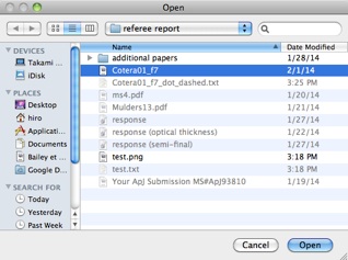
Then you will see a window like below, so select the file for the plot.
If it is your first measurement, follow “Determining the XY axes”, otherwise follow “Measurements”.
2. Determining the XY axes
You will find a window like below.
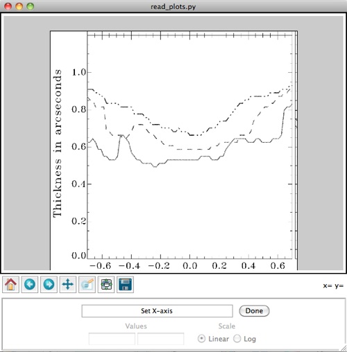
Click two ends of the X axis, then a blue line appear. Adjust the position of the line by clicking small squares at the ends of the line. The square moves with the first click, and it is fixed with the second click. I recommend to make the blue line slightly longer than the X axis in the plot, making margins at two ends.
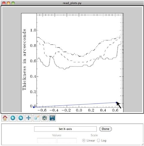
Click the “Done” button when the blue line matches the xaxis. And the message in the GUI will change from “Set X-axis” to “Set ticks and values for X-axis”, and two small squares at the ends of line will disappear.
Then you will find another short blue line perpendicular to the X axis. It will move with the mouse cursor.
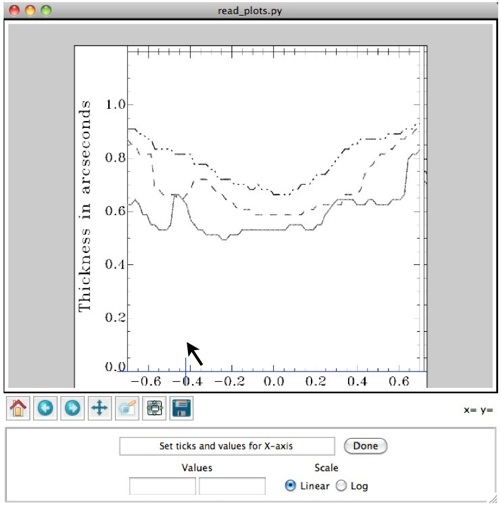
Move the short blue line and click at one of the ticks near the left end of the X axis. Then its position is fixed, and instead, another short blue line will appear and move with the mouse cursor. Click and fix it at one of the ticks at one of the ticks near the right end of the X axis. In the figure below two short blue lines are fixed at “-0.6” and “0.6” in the X axis.
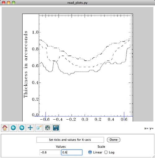
Then describe these values in the entry boxes. Click “log” if the X axis is shown in log scale. Then Click the “Done” button.
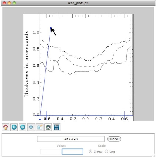
Then the message in the GUI will change from “Set ticks and values for X-axis” to Set Y-axis. Do the same for the Y axis as shown below.
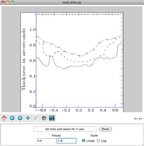
After finishing, the window will change like below.
3. Measurements
You will find a window like below.
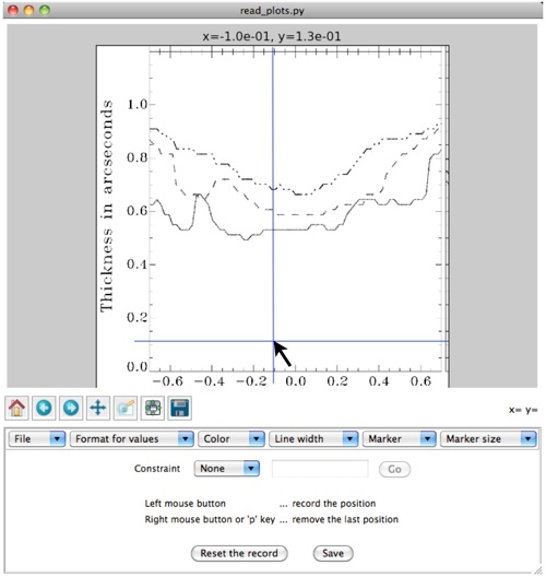
A blue crosshair moves with the mouse cursor. The value at the crosshair and mouse cursor is shown at the top of the GUI. If you would like to change the format of numbers, use the “Format for values” menu bar.
You can move the crosshair with a fix X or Y value. Select “X” or “Y” at the menu bar next to the word “Constraint”, which is shown as “none” in the above figure. Give a number to the entry box and click the “Go” button.
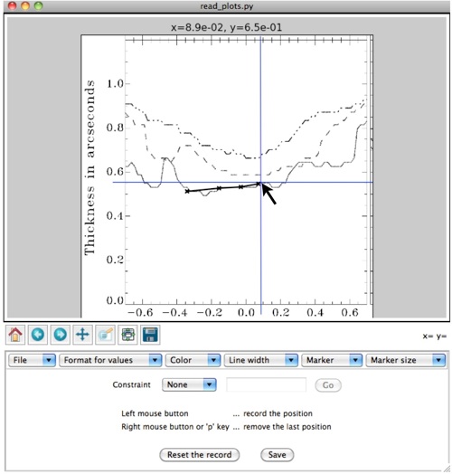
You may record the position of curves by moving the crosshair & mouse cursor and repeat clicking the left button of the mouse. The recorded positions are displayed like those in the figure below. This function works only if you select “None” (i.e., not “X” or “Y”) for the menu bar next to “Constraint”. Use the menu bars “Color”, “Line width”, “Marker” and “Marker size” if you would like to change the parameter.
If you have clicked a wrong position, click the right button of the mouse to cancel. Otherwise. click the “Reset the record” button to erase all and restart from the beginning.
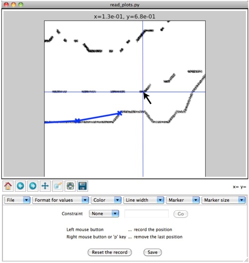
If the plot is too small for accurate recording. Drag the bottom left of the entire GUI to enlarge. Otherwise, use the pan/zoom ( ) or zoom rect buttons (
 ) in the figure tool bar to zoom in. After zooming, click the same button to deactivate and continue recording.
Click the “Save” button to save the recorded points to the text file. You will be asked the file name.
Select “Quit” in the “File” menu bar or press ctrl-Q to finish using.